One of the major lessons marketers have learned over the last year is that text-heavy content isn’t enough to generate interest. Visual content is the way forward.
There is so much more content available online now. Put yourself in your customers’ shoes—what would they prioritize when there are so many choices?
The answer is visual content. Text, as descriptive and powerful as it is, requires labor from the user. The harder a user has to work, the less likely they are to engage with the content.
It is a marketer’s job to ensure that customers don’t have to do that work. Circumvent that problem by using visuals, especially since 65% of the population learn visually.
With increasing data literacy among marketers, brands are now able to design more powerful and memorable visuals. So, what is visual design?
What is Visual Content Design?
All the visual elements that are included on blogs, websites, landing pages, apps, social media, and even newsletter ideas fall into the category of visual design.
These can be subdivided into more categories. For example, blog banners, brochures samples, flyers, posters, and social media posts.
We will break down the primary types of visual content in marketing below.
How Important is Visual Content in Marketing?
What is the purpose of visual content marketing? To drive and scale brand awareness, business growth, and revenue generation.
Visuals also help break up the monotony of text to increase user retention on a page. Not to mention the impact visual content can have on SEO strategies.
So, what kinds of visuals can marketers use to grow their customer base?
5 Types of Visual Content in Marketing
There are numerous visual content types that marketers can use to reach their target audience. But what are the main categories of content that marketers should focus their attention on?
We share five kinds of visuals that marketers can design to grow their audience.
1. Data Stories
As we mentioned, data has become one of the most important kinds of visual content online. But sharing raw data with audiences without context can do more harm than good.
As interesting as data is, it can often be confusing for audiences. What do the numbers and percentages mean to the consumer? What are they expected to do with the information?
It’s up to marketing teams to design content that makes their data more accessible to wider audiences.
There are numerous ways to visualize numbers so audiences can understand the brand message.
Take a storytelling approach to data. Add captions to percentages. Use icons to illustrate numbers.
Visuals help users connect with numbers which makes data stories more compelling and memorable.
2. Infographics
Following on from the previous point, a great way to tell data stories using visuals is by designing infographics.
A wonderful thing about infographics is that they combine multiple elements to share a brand message. These elements include text, images, illustrations, icons, and charts.
Infographics have multiple uses. They can be designed for blog posts, shared on social media, included in presentations, repurposed for multiple channels, and can earn backlinks.
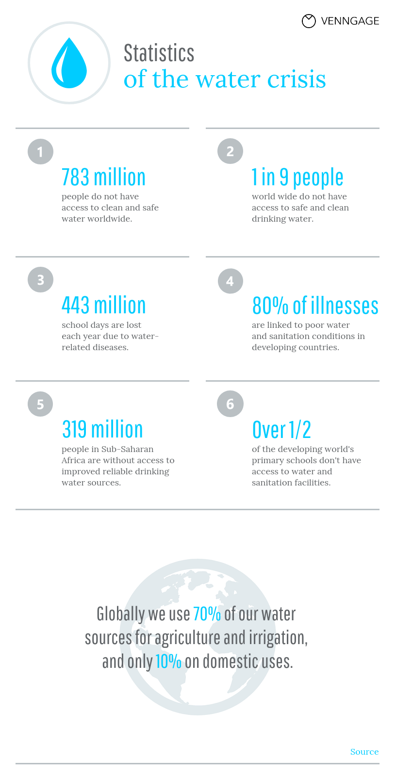
Designing infographics from scratch can be challenging. But there are online resources to help marketers design simple infographic templates, like the one below.
Infographics make complex content more appealing. And according to a website heatmap analysis, infographics encourage users to stay on a page longer, boosting engagement.
3. GIFs and Memes
There’s a common misconception that visual content marketing needs to be serious. But that is far from the truth. Levity is highly appreciated, especially considering the year we’ve just had.
GIFs and memes can bring that much-needed humor to marketing campaigns. Online users are already familiar with these visuals.
This familiarity means there’s less work to do for marketers. It’s easier to build emotional connections with consumers.
BarkBox has successfully used memes to connect with audiences for a while.
Memes and GIFs already have their own stories to share. Marketers simply need to tap into the existing story and adapt it for their brand.
4. Presentations and Slideshows
There’s one aspect of using remote work tools that marketers have overlooked—presentations and slideshows.
Organizations create presentations all the time, so why not repurpose them for consumers?
Some may only require just a few tweaks to be shared externally, but slideshows or presentations can be converted into videos to share on social media, or they can be gated for people to download.
If you’re already creating these kinds of visual content internally, you might as well share what you can externally and use them to grow your audience.
5. Videos and Livestreams
Videos have been a popular type of visual content for a while, but marketers know that creating videos is a tough ask.
Despite the numerous video content creation tools that make the process easier, and despite video being a great way to increase subscriber loyalty, marketers aren’t totally comfortable taking on this task.
But there is a way to have the video cake and eat it, too: live streaming. This is a 2021 content marketing trend that has caught on and doesn’t require the same amount of effort.
A phone or laptop camera and microphone is all that’s needed to stream live on social platforms or video conferencing software. And these live streams are interactive, as well.
Most tools allow users to save the live stream as a video to share later, with hardly any effort required. It isn’t surprising that marketers are using this visual tool to reach audiences. You can either stream on a ready-made platform such as youtube twitch etc, or develop your own streaming platform, depending on your needs
Visual Content Creation Best Practices
We have shared the importance of visual content creation and the types of content that can be created. But there are a few best practices that need to be acknowledged, too.
Follow visual content design rules. Marketers must understand and follow these established graphic design principles:
- Group similar elements together
- Create a visual hierarchy
- Keep sizes consistent
- Use color for emphasis
- Maintain white space around elements
The design rules take some time to memorize, but once marketers get the hang of it, the process becomes easier.
Original graphics make a statement. Stock photos are easy to use. There are numerous sites where marketers can source them for free. But stock photos are also recognizable.
To make an impact with one’s visual content, marketers need to create original content. Visuals like photographs of employees at work or behind-the-scenes videos are always popular.
These visuals also help build emotional connections between brands and customers by showing the human side of the company.
Design branded visuals. There is so much content available online now. How are consumers expected to remember whose content belongs to whom? That is why branding is so important.
Visual content must include branding. Logos, brand colors, and brand fonts should be visible but not overwhelming. These elements will make brands stand out online.
Create visual content that is accessible. Everyone doesn’t experience the world in the same ways. This is why marketers should be designing for diversity.
What does this entail? It means collecting data without bias and making the visual meaningful for diverse audiences. Create designs that are accessible to people with visual impairments.
If you aren’t sure whether your design appears biased or insensitive, get a second or third opinion before sharing it online.
Repurpose visual content. Visuals aren’t single-use tools. You can use the same visual in multiple ways. An infographic can be used on a blog, a newsletter, and a presentation.
But you can also divide the infographic into smaller social media posts. The data and information in the graphic can be repurposed for webinars or eBooks.
When it comes to repurposing visual content, the sky’s the limit.
Key Takeaways
While text can be engaging, it is a labor-intensive process for users. With so much content to choose from, marketers need to be creative to bring attention to their brand.
That’s why visual content creation has become such a great tool to reach audiences. Visuals can be shared on multiple platforms and attract a range of users.
In our guide, we have shared the many elements that make up visual content and the best practices marketers can follow to create designs that make an impact.
Author Bio
Ronita Mohan is a content marketer at Venngage, the infographic and design platform. Ronita regularly writes about digital marketing, data visualization, design, and small businesses.
Twitter: @Venngage


