30 Successful Examples of Email Marketing Campaign Templates
October 25, 2022 16 min read
Much like advertising and branding itself, email marketing campaigns are more of an art than a science.
It takes a compelling idea, great visual design, and excellent copywriting to increase the chances of your email marketing campaign being successful, maximizing clicks, and converting readers into buyers. Email marketing campaign templates can help, but it’s hard to create one from scratch.
Fortunately, your business can stand on the shoulders of giants by taking everything that’s great about existing successful email marketing campaigns and applying it to the context of your business.
According to our recent study, the average open rate for an email campaign is 19.66%
Depending on the size of your newsletter audience and average conversion rate, you’ll need to sharpen up your email marketing skills if you want to reap its rewards.
So, we’ve collected 30 of the most compelling email marketing to use as guides and templates for your brand’s next big campaign.
But first, let’s go over the key elements of crafting an effective email marketing campaign based on the latest best practices and research to make your marketing emails shine from the ground up.
What Makes a Successful Email Marketing Campaign?
Not all email marketing campaigns are created equal.
You can painstakingly craft the single greatest email marketing message in the history of the internet, but if you only have 138 people on your marketing list, don’t expect to see many conversions.
So, before you start nailing down the art and technique of email marketing, keep growing and building your community by targeting your data-driven ICP (ideal customer profile), producing awesome content, offering irresistible incentives, and providing smooth and satisfying experiences. Using a data-driven ICP is hugely important, it’s a good idea to export leads from LinkedIn in order to have a successful email marketing campaign.
The bigger the audience, the greater your chance of email marketing campaign success will be. As for everything else? Remember to keep the following in mind:
- Set clear email campaign goals — You might not necessarily be aiming for straight conversions in your email campaign. Awareness, community-building, or even company apologies are also valid reasons to send an email campaign. Whatever they are, set clear campaign goals and objectives as well as ways to measure them in order to properly determine if the campaign was successful when it’s all said and done.
- Craft the perfect subject line — The subject line is widely considered to be the main determiner of whether or not an email will be opened. Naturally, you want to spend some time getting it just right. Keep it brief, summarize the main ‘idea’ of the email, and reference any incentives you are offering.
- Iterate with A/B testing — A big enough audience grants you the ability to properly test different versions of your creative (copy, imagery) and determine which option is more effective at achieving the goals set earlier in the process. Did you know that only 47% of email marketers test their subject lines before sending them out? That means over half are potentially missing out on an up to 26.96% increase in their click-through rates. Test at least two versions and narrow them down based on how they perform.
- Test all links and CTAs — Even a relatively brief and straightforward email has a multitude of links. If your email marketing software allows you to send test emails, fire off a round of tests to determine if all included links and CTAs are functional.
- Offer something valuable to the reader — Be honest with yourself. How many explicitly marketing-focused emails do you willingly open in a day? The answer is probably zero. Straight advertising is rarely welcomed in people’s inboxes — unless they have something of value to gain from it. Before running any email campaign, ensure you offer something of genuine value to your readers, whether it’s a discount on a product they love or great content that will improve their lives. For instance, if you are in the B2B space, you could cure a list of must-have software tools or craft a newsletter on the “build vs buy” approach.
With that covered, let’s move on to our collection of 30 of the most successful email marketing campaign examples to use as templates for your business’s newsletter.
30 Successful email marketing campaign templates
1. Patagonia
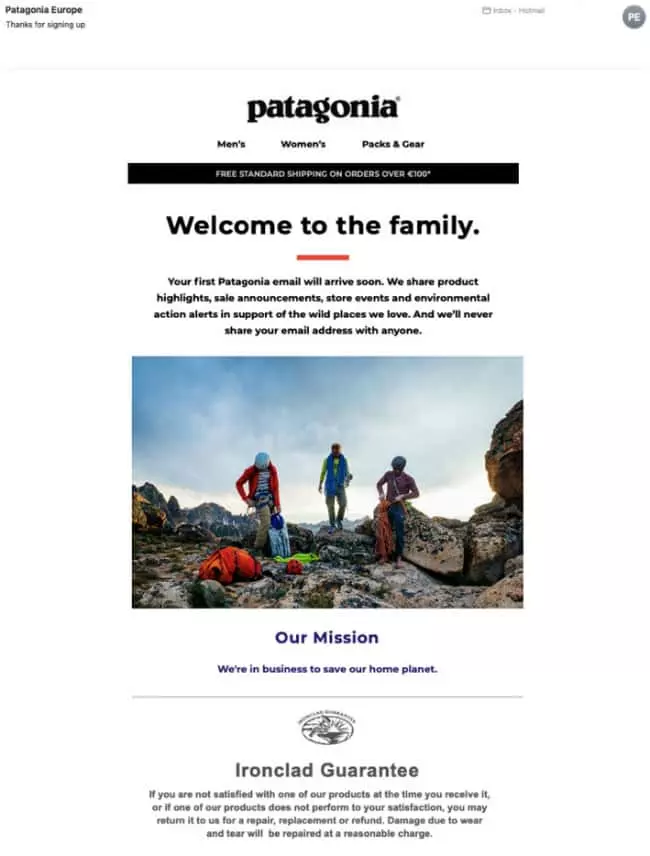
Patagonia shows us how to do the all-important welcome email right.
Community-building is an essential element of successful email marketing. When someone joins a newsletter, they should feel as if they’re becoming part of an exclusive club. This reduces the chances of unsubscription and offers a heightened sense of value, especially when tied to community-based offers and incentives.
Note how they offer a warm welcome, explain the nature of the newsletter, and reaffirm privacy before diving into the brand and product-related info in that order.
2. Nike
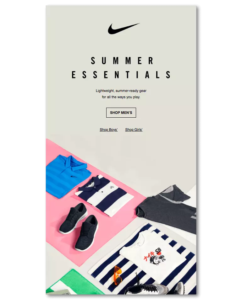
The importance of stunning visual design in marketing emails will vary from business to business.
If you’re a B2B software business, it may not be the number one priority. In clothing and fashion, however, it’s pretty darn important. And that’s undoubtedly why Nike opted for a visual-led approach in this gorgeously minimalistic marketing email advertising their men’s summer range.
With a range of products featured in a way that complements the portrait orientation of the email, we say to those thinking about taking a similar approach: just do it.
3. Casper
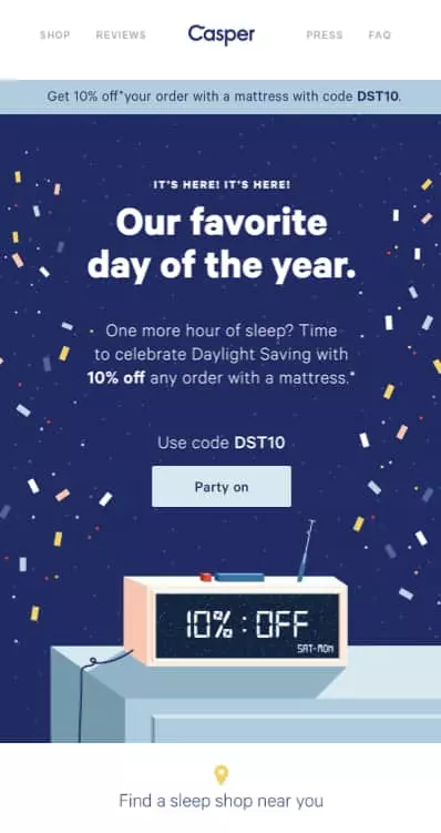
Nothing gets an email opened quicker than the promise of a valuable incentive from a company you care about.
10% off a $2000 mattress is a considerable amount of money, and those who joined Casper’s newsletter are well aware of that.
That’s why they chose an incentive-heavy approach for this email. See how they’ve bolded their 10% offer in the body text, integrated it into the visual design with the alarm clock, and featured the discount code itself alongside a CTA button for silky-smooth conversions.
If you’re offering a coupon, consider combining your email with a limited-time retargeting campaign — this is a lot easier if you use trackable links in your emails.
4. Airbnb
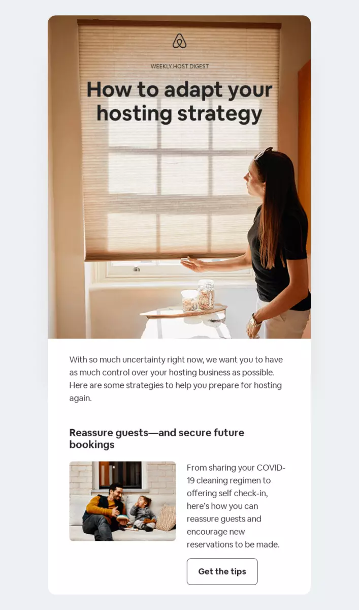
It’s easy to forget the range of possibilities that email marketing offers when everyone seems so focused on conversions. But it’s that exact focus that will dissuade your readers from opening your next email. Remember — no one likes constant email advertising spam.
So don’t forget to work just as hard in providing non-advertising content in your emails, like this example from Airbnb. They offer their hosts (a distinct email list from typical Airbnb customers) information about how to host well in the wake of Covid-19.
5. Mint
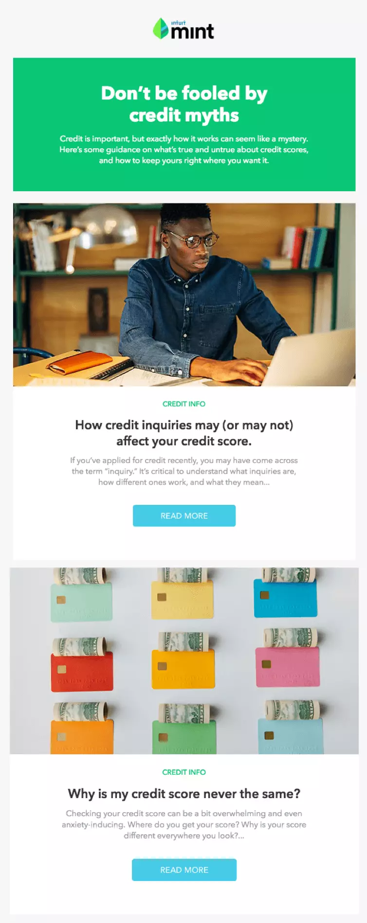
‘Scare tactics’ or ‘clickbait’ would be harsh words for the technique used by financial management company Mint here — but the concepts are relevant.
A more charitable perspective would be that Mint is using incomplete information to draw the reader in, in hopes of finding answers. “Don’t be fooled by credit myths” begs the question: what credit myths? How can I spot and avoid them?
6. Sidekick Content
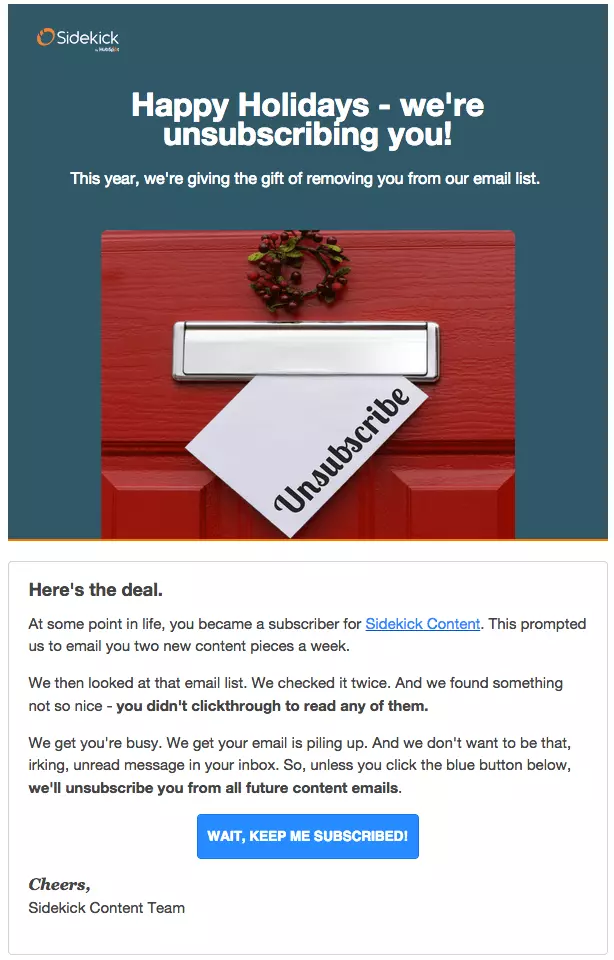
The practice of culling very unengaged subscribers is becoming more and more commonplace in email marketing circles. In fact, 51.9% of marketers reported removing inactive subscribers from their lists.
Not only does it improve open-rate statistics, but it also improves audience analytics, as you’ll be better able to craft relevant emails with a more focused list.
Accordingly, you should have a plan in place for unsubscription emails. The email above is, if a touch snarky, a great example from Sidekick Content.
7. Amazon
You may have heard of this humble mom-and-pop eCommerce store, Amazon.
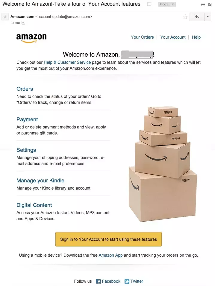
Just kidding. Of course, you have. The thing is, with an operation as sprawling and multifaceted as Amazon, email marketing needs to be less superfluous and really clear.
That’s why Amazon’s welcome email immediately offers every type of Amazon customer all the account management tools they could possibly need right there in the email, in order of importance.
8. Charity Water
This is another great example of using the tool of email outside the context of pure promotion.
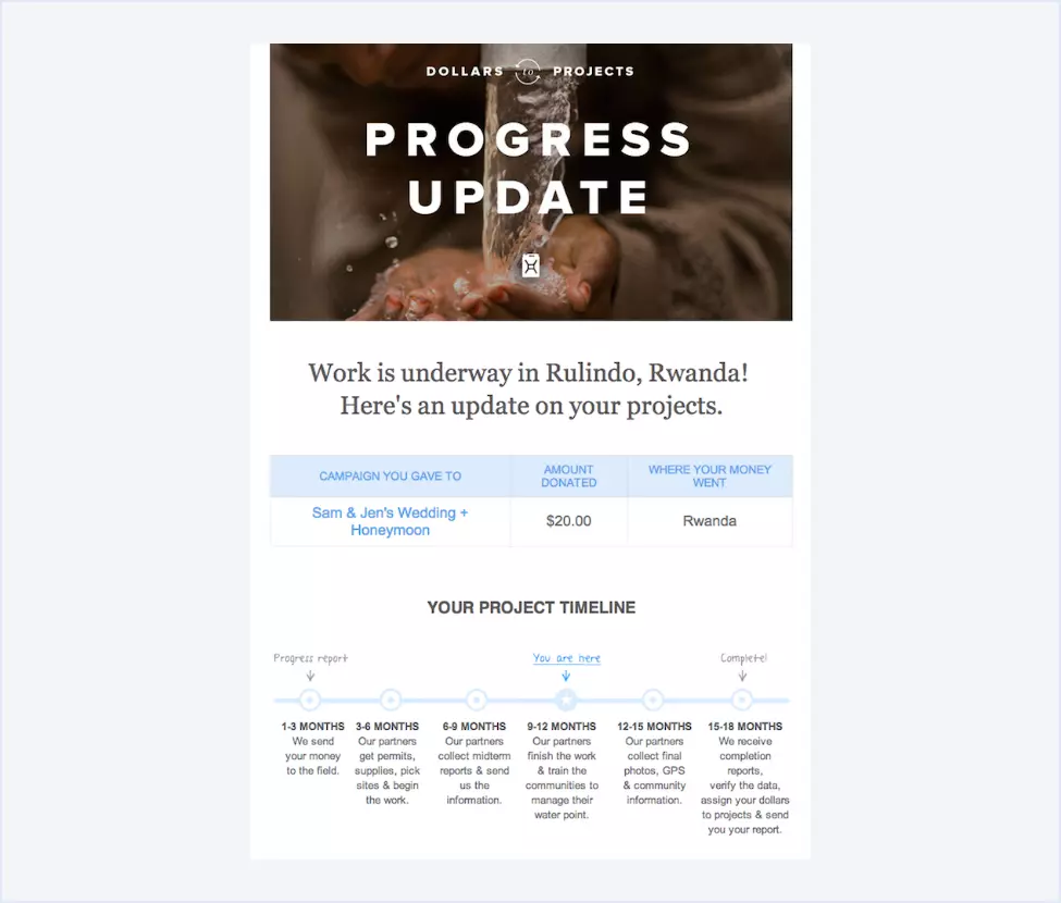
Charity Water updates its patrons with the Dollars to Projects newsletter, which details the exact route a donation takes in actioning the charitable cause.
The typical way of staying updated with a charitable donation would be to visit the website. By repurposing that journey into an email, they maintain a personal connection to their patrons and offer information that will be delightful to learn — making the next donation come even easier.
9. Bluehost
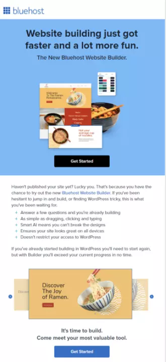
When launching new products, the nature of your email copy should be similar in style and tone to the core advertising campaign that you’ll publish alongside it.
With this consistency, you are developing a stronger brand presence in the minds of your customers and enhancing the omnichannel nature of your business.
In just 15 words, Bluehost summarizes the nature and key benefits of their newest product, a website builder, neatly and clearly.
10. Sweetgreen
When your company is small and financially limited, it’s easy to overlook the virtues of professional design.
After all, you’re handy with photoshop and have a few decent resources for copyright-free images, right?
Sweetgreen is here to dissuade you from DIY design with a powerfully beautiful email that leans heavily into the visual aspect. This email is brilliantly product-focused and looks so good you could almost eat it.
11. True Citrus
Email software and marketing technology have moved on considerably since the AOL days.
And that’s why you can think outside the box every now and then when it comes to the interactivity of your email marketing campaigns.
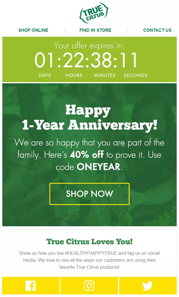
True Citrus has integrated an active countdown timer into this email, which marks the offer expiry date and offers a sense of urgency to the reader, encouraging a click-through.
12. Nike (…again)
You know your emails are good when they make it onto our list twice.
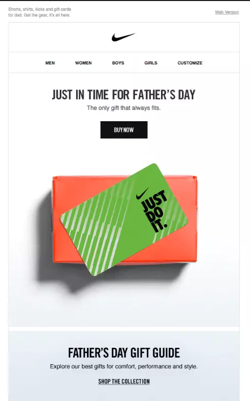
This campaign has it all: a strong ‘idea’ (Father’s Day promotion), elegant, on-brand visual design, efficient and engaging copy, a clear CTA, and a range of other options and pathways for the reader to choose from.
Perhaps the only thing that’s missing is a clear incentive or offer. But you can’t predict what someone’s father would want based on their purchases — at least not yet.
13. Buzzfeed
Just because your business is big doesn’t mean it has to be serious.
Email can be a great channel to apply a more informal tone in your copy. After all, it’s the internet, not a letter sent by a carrier pigeon.
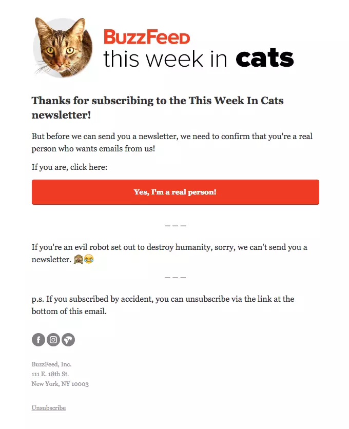
Buzzfeed shows us how to do casual, chatty copy (complete with emojis) for a friendlier approach that’s especially interesting considering the nature of the email to confirm a subscription.
14. KonMari
Here’s another absolute home run of a marketing email from tidying-up master Marie Kondo.
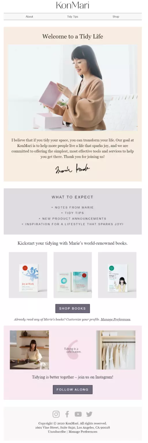
It’s a great example of a welcome email that does a whole lot more than just welcome people. You have the usual greeting and ‘what to expect, but also cross-promotion for the books, a link to socials, and a directory at the top that mimics the site itself for a wide range of navigational possibilities.
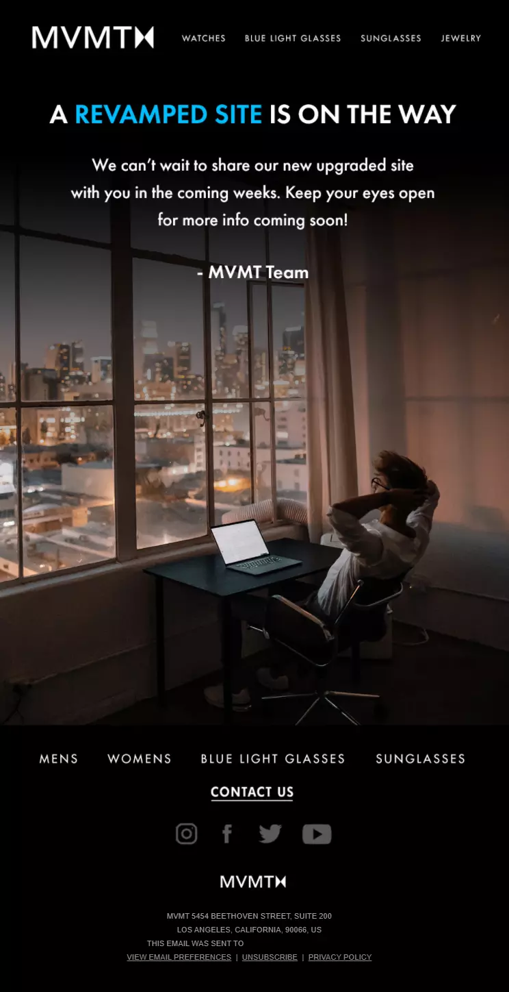
15. MVMT
Don’t waste a great lifestyle branding opportunity when making your company announcements.
Even though this could have been a plain text email and still serve its purpose, MVMT decided to take a different approach.
By investing in beautiful photography, they’ve projected an image of their targeted customer — a young adult who loves technology and style — to their readers, who will no doubt feel recognized by the brand and compelled to buy something when their new site launches.
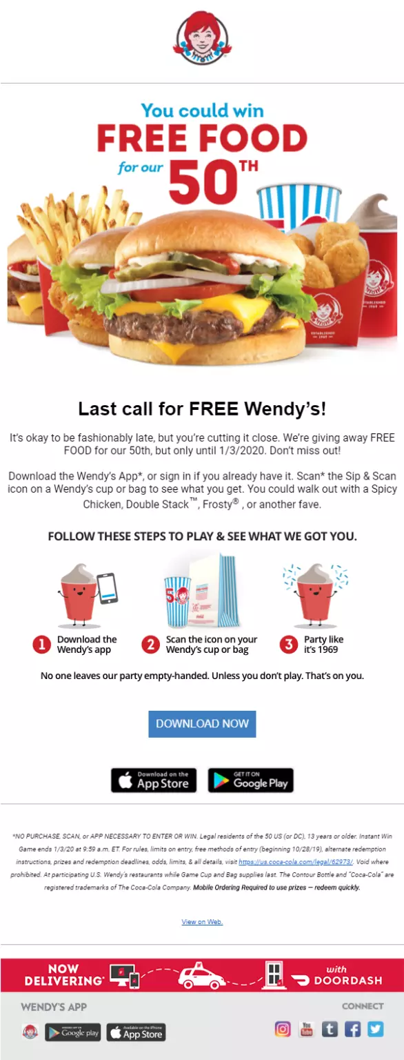
16. Wendy’s
What was the first thing you read when you saw the above email from Wendy’s?
We’re willing to bet that it was ‘FREE FOOD’ and not the actual first words ‘you could win.’
In email marketing, you should never bury the lead.
The thing that makes your email the most clickable is also the thing that should be front and center. Otherwise, you’re misleading your beloved customer, which won’t lead to conversions anytime soon.
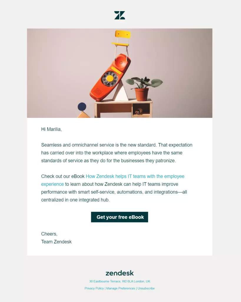
17. Zendesk
If there’s such a thing as humility in email marketing, Zendesk has nailed it.
This email is not cloying. It doesn’t beg you to take advantage of an offer or click through to some sales funnel. It simply offers some valuable content (in this case, an eBook) with a short summary, giving a glimpse of the content and offering the chance to learn more.
Devilishly simple and dangerously effective.
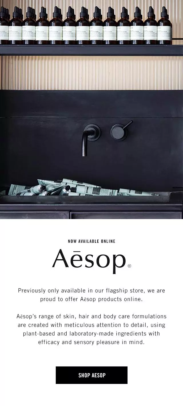
18. Aesop
If there was an award for email marketing minimalism, Aesop might just beat out Nike for the top spot.
In the chaotic world of email marketing, where over 290 billion emails are sent and received every day as of 2019, people tend to forget that more can often be less and less more. People are bombarded with dazzling graphics and endless links in their inboxes, so an email like the above can be a stark and welcome contrast to the noise.
Image > Summary > CTA are all the ingredients you need for a successful email.
19. Blizzard
If your product is based on a vast world of fiction with deep and rich lore and a host of characters, you don’t have to break the fourth wall in your emails.
Instead, use them as an extension of your world to immerse the audience in a new way.
See how gaming company Blizzard frames this email as if it’s a letter from a fictional character in their game universe, and think about how you might do something similar.
20. EM Cosmetics
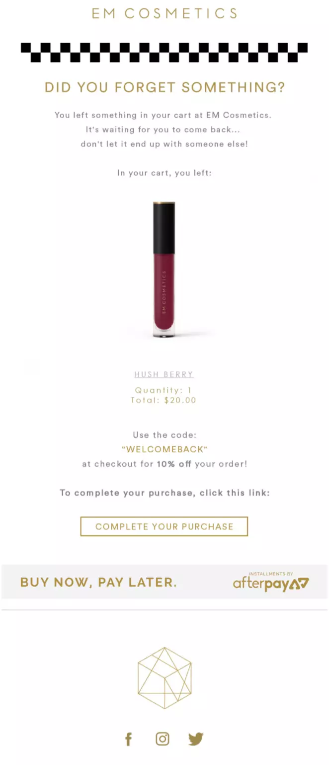
It’s astonishing to imagine just how much money has been generated worldwide from abandoned cart recovery emails. It’s equally astonishing to imagine just how much is lost as a result of not sending them.
Don’t become one of those companies. Customers who added items to their basket are essentially product-qualified leads, which means they’re more likely to purchase.
And 66% of marketers consider email automation to be the most important factor for improving email marketing effectiveness — so it’s time to get your campaigns set up.
In line with this, you should consider getting an automated abandoned cart mailer setup ASAP and reference this EM Cosmetics email when designing your own. It includes the product that was abandoned alongside an exclusive discount to get customers tempted to take the leap.
21. Audible
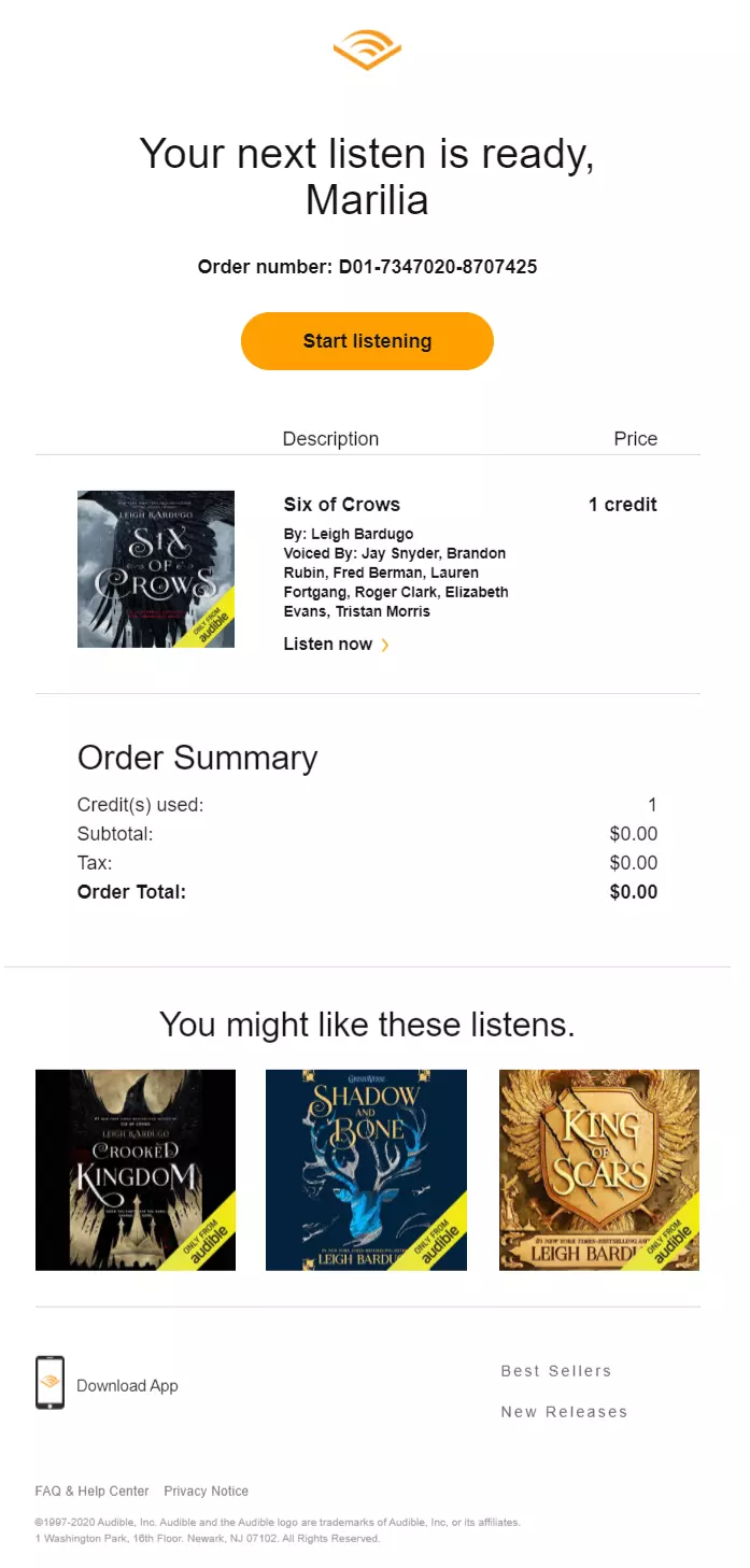
While this may not be a ‘marketing’ email in the strictest sense of the word, Audible understands never letting a good promotional opportunity go to waste.
Accordingly, they add a simple, minimalistic, and intelligent ‘You may also like’ section in their order confirmation emails.
The products are in the same book series as the one just ordered, so the reader can simply refer back to this email to get a jumpstart on the next one when her credit rolls in.
22. Missguided
Here’s a masterful approach to playfully re-engaging dead subscribers in a way that matches the style and tone of its audience.
With simple, uncomplicated copy that drags the reader down to the CTA, Missguided mirrors the text-talk of their young female audience, complete with emoticons. It’s fun, doesn’t feel desperate, and concludes with a powerful incentive that’s sure to get people shopping again.
23. Artifact Uprising
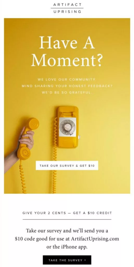
Speaking of incentives, there may be no other more relevant places to put them than in a feedback request email.
These emails help you sharpen and refine your offering by gaining insightful thoughts and opinions from your audience.
But your audience doesn’t work for you. So, if you’re going to send a feedback request email, do it like Artifact Uprising and offer a real monetary incentive. You’ll be flooded with real customer feedback, plus you can drive more sales through couponing.
24. Tiffany & Co.
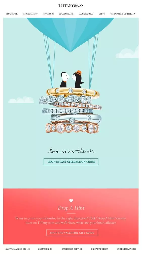
Remember when we said email marketing is more of an art than a science?
There isn’t a single better example of that principle than this one from Tiffany & Co. This must have been cooked up by some seriously talented marketing folks.
It has all the grace in its presentation of a print ad, prominently featuring a beautiful design concept that encapsulates the product, the audience, and the occasion all in one. Bravo. If you’re in a similar industry, create a template that puts visuals front and center.
25. The New York Times
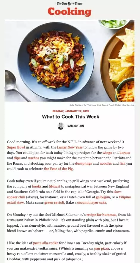
Here’s a great example of a company utilizing knowledge of audience behavior to craft a seriously worthwhile email.
Here’s the thing about pretty much everyone who signed up for The New York Times newsletter: they love to read (duh).
So, instead of barraging their audience with a bunch of links, they simply put the content in the email. The reader doesn’t have to leave their email client to absorb the value of the content. This approach certainly has its drawbacks, but for NYT, it makes all the sense in the world.
26. Mejuri
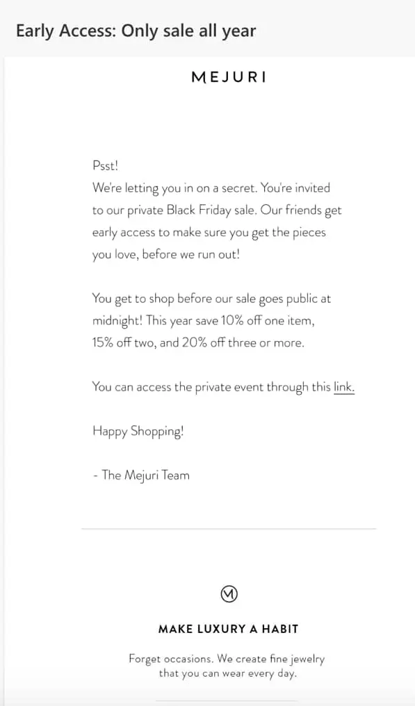
We’ve talked a lot about minimalism in the context of copy but less so when it comes to visual design.
Mejuri is here to show us that you don’t actually need fancy graphics or illustrious product imagery to get the job done.
The effect is a stripped-back, conversational email that almost feels like a message from a friend. When in doubt, don’t overcomplicate things.
27. Care/of
If you’re wondering how you can perfectly blend informational content with product-focused advertising, look no further than this example from Care/of.
They are a wellness company that sells mostly vitamins and supplements. At first glance, this email seems like an information piece on the health benefits of mushrooms until you eventually learn that they pack all of these benefits into a convenient little supplement that you can purchase.
It’s very slick and looks great, to boot.
28. Carnival
This email is something of a classic in the email marketing world, and for a good reason.
It’s a brilliant visual gag that urges users to scroll down, through the depths of the ocean, to find the hook — the low deposit prices.
Copying this exactly would be no fun, but it’s a great lesson in interactivity, playing with the format, and the blended use of copy and visuals to create a truly memorable email.
29. Four Seasons
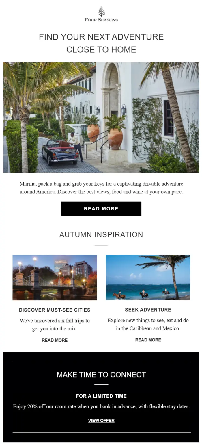
Personalization is a powerful weapon in your email marketing armory.
Names, birthday recognition, and tailored recommendations never fail to jump out at the reader, lighting up their attention and making the following email more memorable.
See how Four Seasons always begins their marketing emails by addressing their recipients by name, as an example.
30. J. Crew
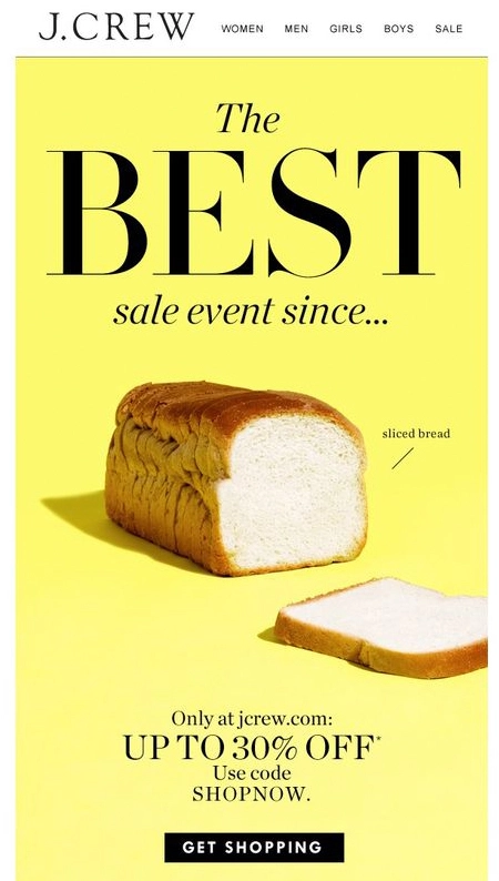
Sometimes in advertising, you need to do the unexpected.
That’s why J. Crew, instead of opting for the usual ‘here are some J. Crew clothes’ style email, chose a wackier and indeed more effective approach.
Why does putting a picture of a loaf of sliced bread make sense for a clothing company? Because it doesn’t. Which is fun and very memorable.
Email Marketing Success
As you can see, there’s no ‘one-size-fits-all’ approach to email marketing campaign success.
It takes creativity, collaboration, and the right email marketing tools to become an effective email marketer.
Just keep our email marketing best practices in mind, and come back to these great examples when the inspiration well is running dry.
Author Bio
Brad Smith is the Founder of Codeless (a content production agency) and CEO at Wordable.io. His content has been highlighted by The New York Times, Business Insider, The Next Web, and thousands more.
