The return on investment (ROI) of email is incredibly enticing — Litmus puts it at 3600%. However, to get that ROI, or anything close to that, you must get the email header, body, and footer right.
This guide will examine the all-important first part: the email header. Email headers play a vital role in the overall success of your email campaigns. An effective email header — one that reveals the purpose of the email — sets the tone for your message. It hooks the reader and makes them want to read the entire email.
Read on to learn why a great email header is crucial. We’ll discuss seven components of an email header and suggest best practices to ensure every header is highly effective at driving your email marketing goals.
But first, let’s go over the basics:
What is an Email Header?
An email header in HTML email templates refers to chunks of code that contain data critical to email deliverability. It includes sender-recipient details, MIME version, message ID, return path, X-Spam status, and more.
However, that’s not the type of email headers we’ll discuss here. Instead, we’ll focus on the design elements of headers that appear at the top of your emails.
Why is the Email Header So Important?
As mentioned above, an effective email header describes the purpose of your emails in a way that hooks the target audience. It encourages the audience to read your email, and in doing so, it boosts:
- Email open rates: A great email header helps your email stand out in the reader’s crowded inbox. It helps build brand recognition, and the reader will have a compelling reason to open the email if the subject line is relevant and persuasive.
- Email engagement rates: Engagement rates and email open rates are directly correlated. The more readers that open your email, the higher the engagement.
- Conversion rates: When you give the audience something to get excited about in the header and follow it up with great copy and a CTA, your email will have a high click-through rate.
7 Components of an Email Header
1. Company Logo
The email header is where you showcase your visual identity and introduce your brand to the audience. To that end, the email header should include your logo. Adding a logo in the email header serves two purposes. Firstly, it eliminates any iota of doubt the audience may harbor regarding the email sender. Secondly, it improves brand identity and enables the audience to recognize your company outside email circles.
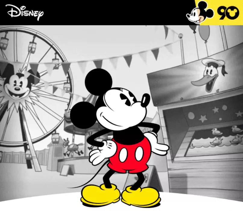
If you’re not using a logo, you can use a brand mascot — if that’s what your audience is most familiar with. For example, Disney uses the Mickey Mouse mascot, which has a 98% recognition rate.
2. A Short, Convincing Subject Line
The email subject line should tell the readers what’s in it for them in the fewest words possible. The subject line needs to be convincing, too — no reader will continue reading the email if the subject line doesn’t resonate with their preferences or interests.
3. Menu
The whole purpose of email marketing is to boost conversions and sales. To ensure that happens, email senders need to be able to encourage readers to click on a link or CTA in the email. Doing so lands them on a particular page of your website where they can make a purchase.
It’s a journey, but that journey can be made simpler by adding a menu to your email header.
Menus can serve as a mini version of your website and are a quick way to drive traffic to specific web pages. They can hype up the engagement of your email and improve user experience significantly.
4. Call-to-Action (CTA)
Every email you send should have a CTA, especially if you want to increase traffic to your website. Never bury your CTA. Instead, place your CTA front and center of the email header to make it easier to spot for readers. This also ensures that even if they don’t read the entirety of your email, they’re still getting the most important information first.
5. Social Media Icons
You should also add social media icons to encourage your email subscribers to follow your brand on social media. Doing so allows you to engage readers on a whole new level. If you have been engaging your audience through email or newsletter, prompting them to become your social followers opens a new communication channel and will reinforce brand recognition.
6. Header Images
The images you use in the header should instantly grab the reader’s attention. The header is a good spot to introduce your newest product, advertise a revamp to your existing product, or promote an event or release. Make sure you use high-quality images and graphics, so your readers will be intrigued, engaged, and want to check out the remainder of the email.
7. Countdown Timers
Countdown timers may not suffice for every email campaign, but they work magic for time-limited sales offers and promotions. For example, you can use them in your holiday campaigns for Black Friday or Cyber Monday sales to boost interest.
Countdown timers are great because they add urgency and instill a sense of FOMO that can help lead to more sales.
Create Great Email Headers with Benchmark Email
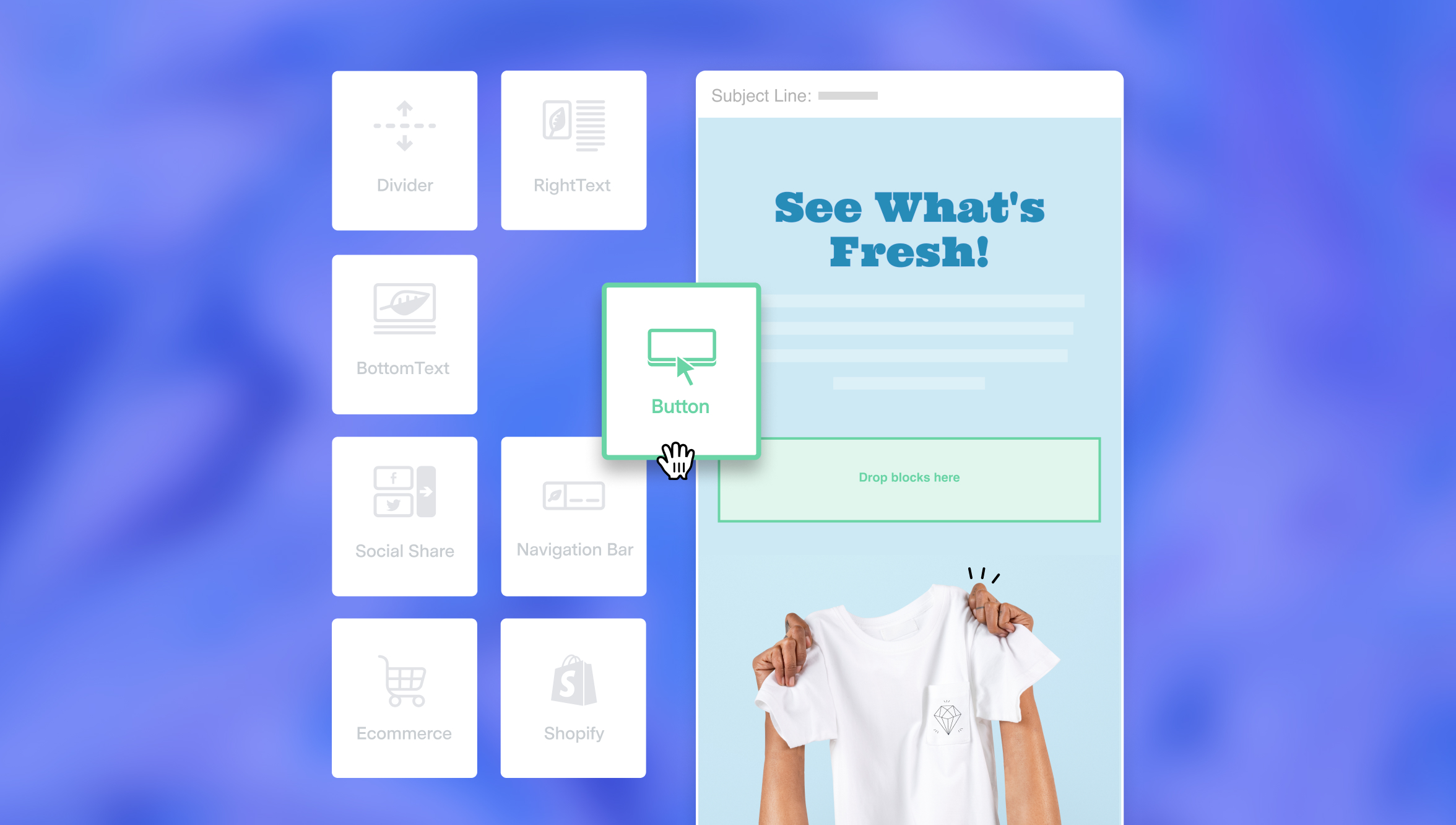
Start creating effective email headers today with Benchmark Email. You don’t have to build everything from scratch; the customizable templates let you make eye-popping email headers that match your branding.
There is a template to match your campaign or niche, whether you’re in the restaurant, software, sales, marketing, technology, or retail vertical. Sign up for a free plan and get access to tons of these email templates, modify them and incorporate your branding, then test them out and see how your subscribers respond.
