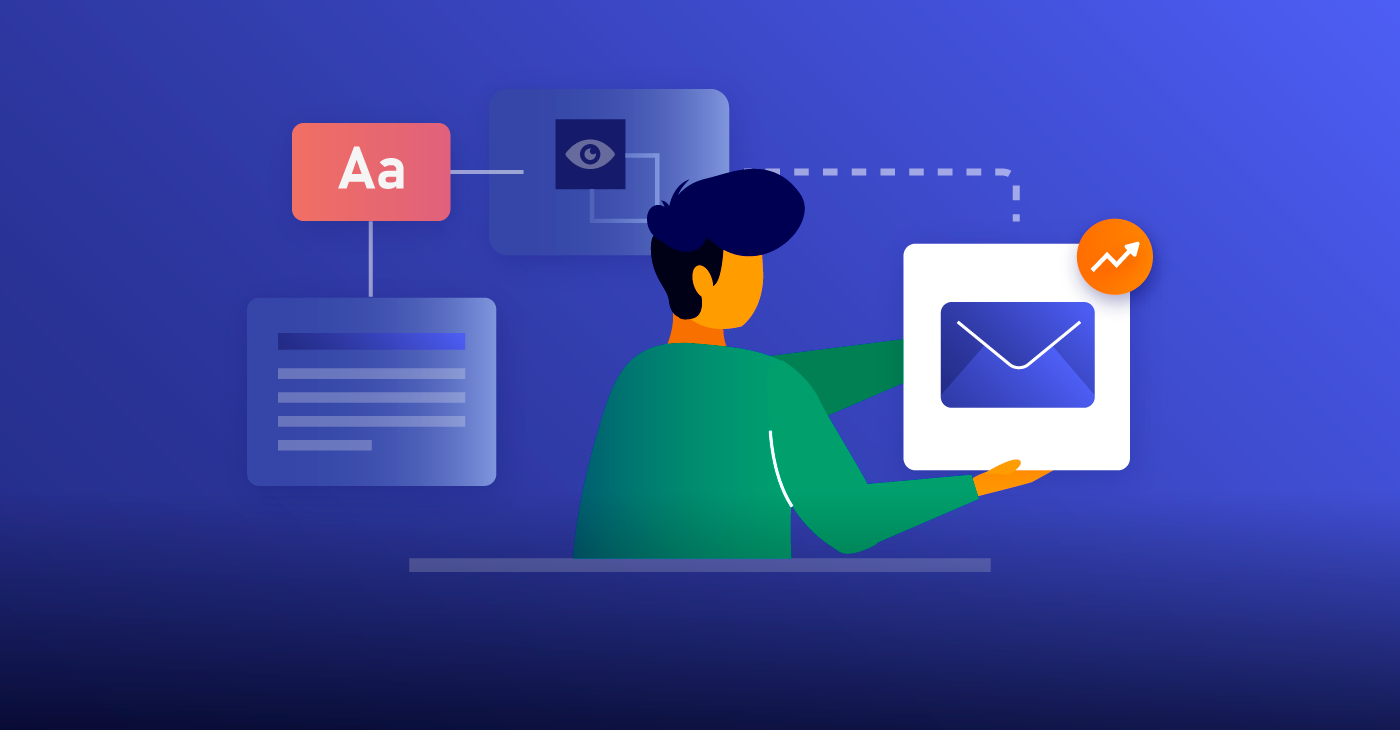
Content or Design: What Matters More for Your Email Marketing?

When it comes to email marketing, what holds the most weight, email content, or email design? The answer, which likely isn’t very surprising, is that it’s both! Successful emails are balanced, beautiful, and pleasing to the eye. They’re also filled with valuable, conversion-driven content for your subscribers. And you’ll need to prioritize both if you want your emails to make as much of an impact as possible.
In this article, we’ll go over the role that email content and email design play in effective digital marketing. Keep them both in mind when you create your emails, and you should have no trouble keeping your recipients engaged.

The Value of Email Content
If we pare down email marketing to its most basic purpose, then it is, above all, a tool for sending content to prospects and leads. Sending emails is a way to share insights — and for those insights to drive some sort of action on the part of the reader. That means that the actual text and substance of what you’re sharing is incredibly important.
You never want to email your subscriber list without an apparent reason for doing so. That wastes everyone’s time (including yours) and may make it difficult for you to build and maintain trust with your contact list — assuming they decide to stick around. The content of your emails needs to provide some sort of value, and it needs to be obvious to your subscribers what that value is.
Additional content features that are important to include in your emails include:
- Catchy and engaging subject lines
- Short but descriptive preview text
- A format that isn’t too lengthy and that is laid out in a digestible, easily skimmable way
- A clear and powerful call to action
- A “From” line that includes the contact information for an actual member of your sales team
To get the most bang for your buck when it comes to email content, you’ll also want to make sure that your content is personalized for its recipients. This shows that you both know and care about the needs of potential buyers at all stages of the purchase cycle, and even more crucial, that you have the resources to address those needs. When you personalize your email content, you help build trust and reliability, and you also add that all-important value feature.
The Value of Email Design
Everyone loves looking at pretty things — it’s why photo aggregate sites like Instagram and Pinterest are such mainstays of the digital marketing world. Images and design elements help evoke certain emotions, and those emotions can work in your favor when you’re trying to guide leads to a sale.
Great email design helps make your messages easier and more interesting to read. And those are both keys if you want to keep your subscribers opening your messages. Think of ways to frame your content that both highlights the most important parts and makes them as entertaining as possible. Paying close attention to these areas will help you do it:
- Layout. Make sure that the overall layout of your email design is clean and balanced, with just the right amount of white space. Your layout should flow smoothly, and should also be driven to lead to conversions.
- Icons. Adding small icons or other visual elements like bullet points and checkmarks helps emphasize certain points that you’re trying to make, and also adds some visual diversity to the page.
- Header image. A well-designed email should always have some sort of image at the header that provides a hierarchy to the layout. These header images will likely look different for different types of emails in your marketing campaign, for example, newsletter headers versus drip campaign headers versus promo email headers. They should all have one thing in common, however, which is a clear and obvious tie-in to your brand — and the message that you’re trying to sell.
- Logo and colors. This is one of the most significant areas for allowing your company branding to come through. Make sure you set clear brand guidelines for these features, and that everyone follows them when adding branding and design elements to your emails.
- Font. No comic sans here! Keep your fonts clean, modern, and easy to read.
- Call to action. Use design features to draw eyes to your CTA. Things like click-through images and buttons associated with your CTA will make it more likely that your readers see it on the page, in turn making it more likely that they’ll click through.
- Footer. The footer is a great spot to add your social icons so your readers can easily find you on other channels. Use icons to call out this section of the message and make it more visually interesting.
Good design and content can make a huge difference in how your emails perform. Understanding the value of both — and the best practices for deriving that value — will get you far. Follow the tips above, and you should start seeing great results!
A powerfully simple email marketing platform
Sign up for free to see how effortless email marketing can be.
Our Company
Compare
Solutions
Compare
Account
© Polaris Software, LLC Benchmark Email® is a registered trademark of Polaris Software, LLC
© Polaris Software, LLC
Benchmark Email® is a registered trademark of Polaris Software, LLC